
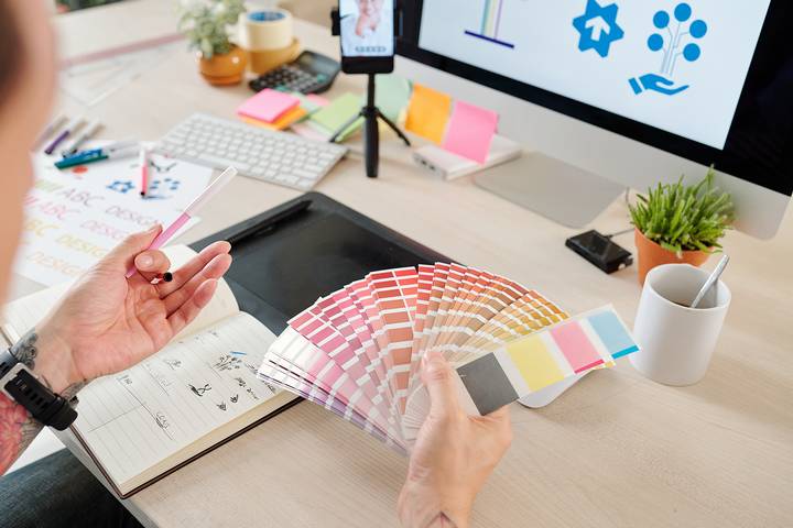
Colour psychology dictates that some colours work better than others in the business. Coca-Cola is in red. Facebook is in blue. Apple is in white. McDonald’s uses yellow. With any colour, you can probably develop a brand that’s identified with it. This is particularly applicable to a business logo. An iconic logo is simple and direct, and instantly recognizable.
The colour you choose to use in your brand’s primary visual symbol matters. Here are the best colours for a business logo.
Colour #1: Yellow

Yellow is an attention-grabber. Think of yellow as the sun in the sky. Yellow is frequently used with companies looking to appeal to younger audiences, such as McDonald’s, or to represent feelings of optimism.
Yellow is very corporate-friendly and a popular choice for a logo maker. is often used in lighter shades as a complementary colour. Yellow is also sometimes combined with shades of blue in a light-bold pairing that is not too intense for the average person.
Colour #2: White

White is a colour often used in tech and medicine. It’s minimalist, trendy, and clean. White as a business logo doesn’t work independently but can help separate other colours or is used as a common background.
The colour psychology behind white is that it is closely associated with purity, sincerity, simplicity, hygiene, and peace. It’s one of the more inoffensive colours but requires being paired with the right partner to make the ultimate logo.
Colour #3: Blue
Blue is authoritative and represents trust. Blue can be striking or provide comfort and calm in the right presentation. It is a common colour used in the corporate world, representing communication, security, and confidence.
This is why blue is used in over 75% of credit card brands’ logos. It is one of the most common business logo colours brands use in many industries. Blue has long been a colour that’s worked in modern and traditional contexts.
Colour #4: Red

Red has an intensity to it. Use it wisely. As a colour, red is often used to express individuality, but in some industries, it is nearly non-existent. For example, red is rarely used in apparel business logos. Red’s meaning can be interpreted as overly dark and gothic or exciting and warm.
There is a lot of variance there, which is sometimes not good. It’s best to use red subtly and in combination with a more dominating colour. You rarely see a business logo exclusively done in red without a clearly defined purpose.
Colour #5: Black
Like red, black has different meanings to different people. To some, black is stable, direct, and confident. To others, black is edgy and rugged. Black also has its meaning change depending on what colour surrounds it.
Black is adaptable and often combined with an orange, red, or blue. Black is often used in tri-colour logos, helping to deliver messaging in a way that doesn’t overwhelm.
Colour #6: Orange

Orange is enthusiastic and often used in combination with black. A more interesting alternative to black-and-white, orange in this context, adds some thrill. You will see orange used with companies trying to communicate adrenaline and excitement, such as those in sports and athletics.
Orange is quite a punchy colour, and done wrong can feel like Halloween, so be careful about what you pair it with.
Colour #7: Purple

Purple has a playful and feminine side to it, but as a colour, purple can also be quite a serious pick. Purple is used in high-end retail, cosmetics, and brands that appeal to an upper-class or luxury and predominantly female demographic.
If you aren’t going for a softer shade, a bright purple can be quite dramatic, representing power and intuitiveness. Cadbury’s use of purple in its wrapping is a great example.
Colour #8: Green

Green is perhaps the best colour for a business logo for a company with an eco-friendly, natural aesthetic. Green can be used individually or to harmonize with earthy tones to craft something extra-special for a business, such as how Starbucks has adopted green across its products.
Green can represent clarity, creativity, openness, and transparency when on its own. Think of green as a colour that suits any business you want to communicate growth and renewal.
Colour #9: Peach

Peach is calm and elegant. As you open the door to more neutral tones, peach is a popular choice for a business logo.
You will often see peach and neutrals used in fashion, home décor, health and alternative medicine. It can be quite cozy but is a versatile colour that balances light and warmth.
Colour #10: Brown

Brown is under-utilized in the world of business logo colours. Though not an average choice, brown stands out when mixed with a neutral pink, desert sand, or a nice gray.
This is sometimes pursued in fashion or interior design. Like green, brown can be reminiscent of the ground and growth.